The Centers for Disease Control (CDC @CDCgov ) and the New York City Department of Health and Mental Hygiene (NYC Health @NYCHealthy )...
The Centers for Disease Control (CDC @CDCgov) and the New York City Department of Health and Mental Hygiene (NYC Health @NYCHealthy) are misleading us about the risk of being unvaccinated against SARS-CoV-2 (CoV2).
They are doing this through two basic errors. First, they appear to be using outdated population estimates that grossly undercount the actual number of unvaccinated persons in the United States. This leads to artificially inflated estimates of COVID-19 case rates among the ever-shrinking unvaccinated population.
Second, they appear to be counting every person for whom they cannot verify vaccination status as an “unvaccinated person.” In many cases, it appears that it is taking health agencies weeks, if not months, to properly match COVID-19 hospitalizations with vaccination status, and we have no assurance that it is ever done properly at all. This has led to some jurisdictions quietly publishing significant corrections to their data weeks after initial publication — and after the media and public health officials have already run with the erroneous numbers. This is leading to both overstatement of the COVID-19 case rate for unvaccinated persons and understatement of the same rate for vaccinated persons.
A re-examination of the data without these errors will show that while the COVID-19 vaccines have been effective at reducing hospitalizations and deaths from COVID-19, their effectiveness has been grossly overstated in America.
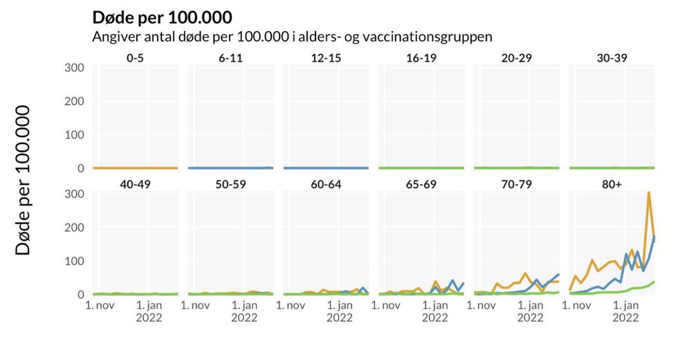
Consider these charts, which were widely promoted by American media in order to support the desirability of COVID-19 vaccine mandates.
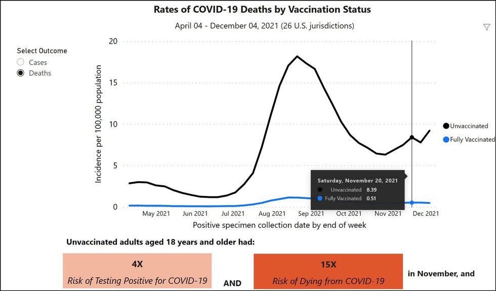
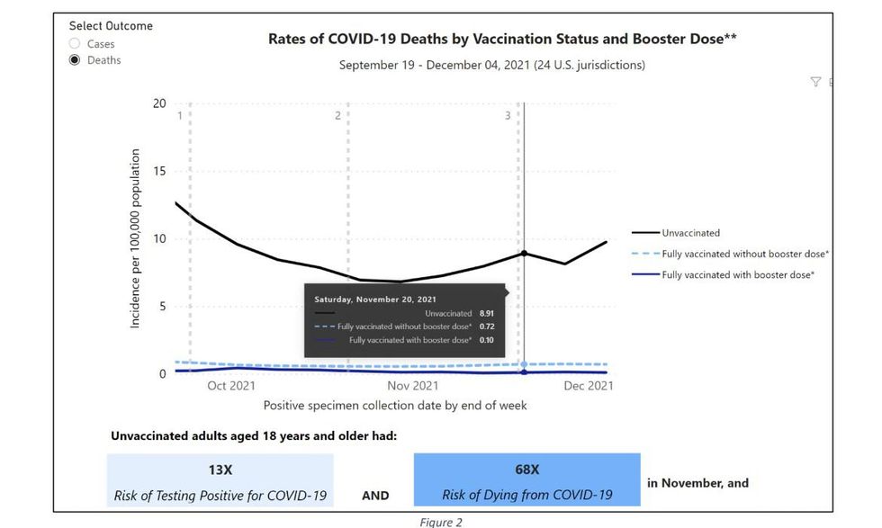
Based on these and similar charts, the nation’s leading health officials, including Dr. Fauci and President Biden, have erroneously claimed that you are up to 97 times more likely to die if you are not vaccinated and boosted against COVID-19.
WATCH LIVE: White House COVID task force holds news briefingyoutu.be
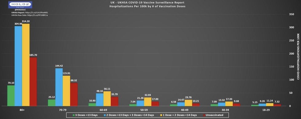
There is one huge problem with these claims: They are not true. Not only are they not true, but they are wildly out of sync with what we know about the efficacy of the vaccine in other countries, such as England, Scotland, and Denmark, where the difference between mortality and hospitalization rates for the unvaccinated and the boosted is in the single digits.
The CDC’s own website tells us where the problem begins. If you examine the CDC COVID Data Tracker page for “Rates of COVID-19 Cases and Deaths by Vaccination Status,” the footnotes indicate, “An unvaccinated person had SARS-CoV-2 RNA or antigen detected on a respiratory specimen and has not been verified to have received COVID-19 vaccine.” Get it? If the health agency cannot specifically verify that you have been vaccinated by matching you with a vaccine record, you are automatically placed in the “unvaccinated” pile of cases.
However, a couple things should be obvious. First, matching deaths or hospitalizations to a vaccine record is a process that is a) imperfect and b) takes time. This means that, inevitably, the data will initially count at least some people as “unvaccinated” who have, in fact, been vaccinated, just because the records have not been matched up yet. And there is ample evidence, which we will discuss later, that this can take weeks or months to do properly. This has the obvious result of skewing both death and hospitalization numbers toward the unvaccinated population, at least in the initial publication of data.
A second factor — and perhaps more significant — is introduced by the CDC in its computation of what the entire population (and unvaccinated population) actually is. According to the CDC’s website, “Weekly age-specific incidence rates by vaccination status were calculated as the number of cases or deaths divided by…unvaccinated (obtained by subtracting the cumulative number of fully vaccinated and current estimates of partially vaccinated people from the 2019 U.S. intercensal population estimates)…”
In other words, the CDC calculates the estimated unvaccinated population in the United States by subtracting the total known number of fully vaccinated people (which it gets from fairly reliable data that is provided by state and county health agencies when vaccinations are reported to them) from an estimated total population count of the whole country. The estimate they are using is the 2019 U.S. intercensal population estimate.
This method of estimating the population is due to introduce significant errors into the CDC’s calculation. For one thing, the further the intercensal population estimate gets from an actual census, the less accurate it is presumed to be, and the 2019 intercensal estimate is as far as you can get from an actual census before a census is taken again. Second, the United States population grows every year, meaning that the further we get from 2019, those estimates get even more erroneous. For 2021 cases, there have been three years of population growth that have been ignored, meaning that both the total population count and the estimate of the non-vaccinated population are wrong.
To understand how these errors combine to vastly overestimate the efficacy of the COVID-19 vaccine, consider the diagrams created by @OurWorldInData in an article explaining death rates by vaccination status and how the base rate fallacy can mislead people. Basically, you must be aware of the percentage of people unvaccinated before you can accurately compare their deaths to percentage of deaths who are vaccinated.
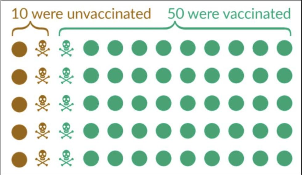
In the figure above, which illustrates a hypothetical scenario, you see 10 total deaths split evenly among unvaccinated and vaccinated, but there are only 10 total unvaccinated people with 50 total vaccinated people. The result of this is a 5:1 death ratio for unvaccinated compared to vaccinated.
However, we must continue past this OurWorldInData example to show the effect of using incorrect population estimates.
It is likely, just comparing the latest estimates with the 2019 intercensal estimate, that the population of the United States is more than 5% higher than the 2019 intercensal estimate. However, assuming that the total increase is only 5%, which is almost certainly on the low side, the diagram below shows the impact of this error on the overall calculation of the vaccines' effectiveness.
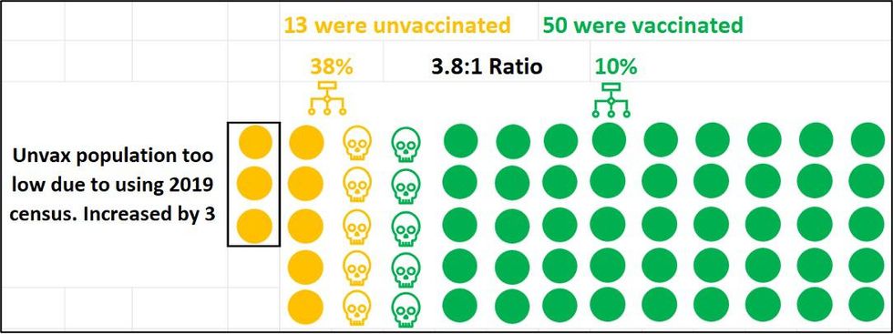
Though the increase is only three, all three go to the unvaccinated side based on the CDC’s calculation method. The CDC knows for sure how many people have been vaccinated, because that data has been fed to it by local health agencies. It has to estimate the number of unvaccinated people by subtracting the known vaccinated population from the total population. So, every person who is added to the total population count is unvaccinated. In our example, increasing the total population by 5% increases the unvaccinated population by 30%, which then reduces the death ratio from 5:1 to 3.8:1.
But in addition, we also must calculate the effect of what happens when additional vaccine record matching occurs and finds that one of the five unvaccinated deaths was a vaccinated person.
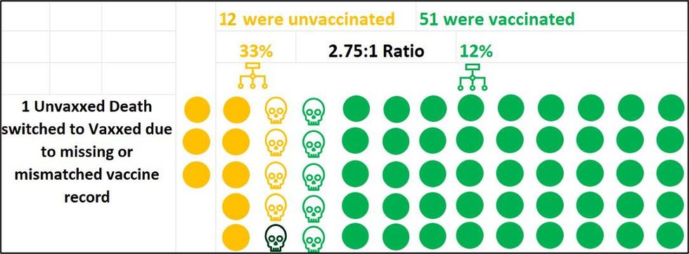
In this hypothetical, this now reduces the death ratio from 3.8:1 to 2.75:1 for unvaccinated. If we match one more vaccine record, the ratio drops even further, to 2.08:1..
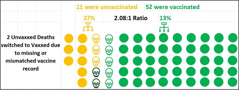
It is important to note that these are not actual figures, but rather only a crude example to illustrate how the math works.
If we plug in the actual data, we cannot know for sure the extent of the CDC data discrepancies, but we can try to approximate.
Since the CDC’s data only shows COVID deaths through Dec. 4 and is only updated once per month, I began looking at New York data in my home state. More specifically, I investigated New York City data because it is published in a large GitHub repository for anyone to peruse and is updated weekly.
When I first looked at the NYC Health COVID-19 Data site, I immediately noticed the dramatic difference between unvaccinated (97.46) and vaccinated (3.00) hospitalization rates, which is ~32.5:1 (Fig. 7). Besides this large differential appearing implausible, I also noticed the vaccinated line appeared to peak the week before (12/12), while unvaccinated was still skyrocketing. This did not make sense at all, which enticed me to explore how these rates were derived.
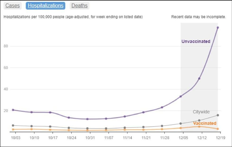
Take note of the description at the top of the graph, “Hospitalizations per 100,000 people (age-adjusted, for week ending on listed date).” From this, it is clear that there are at least two mathematical issues to uncover: 1) What population is being used for the “per 100K” calculation, and 2) How the age-adjustment is being done.
Within GitHub, I was able to find both explanations:

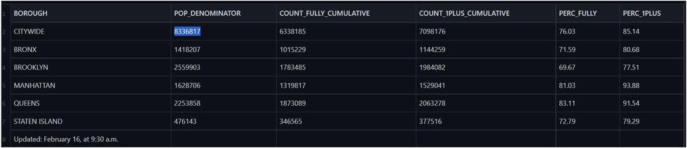
The NYC Health 2019 intercensal population estimate turns out to be 8,336,817 as shown in the figure below.
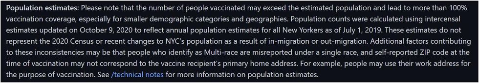
However, this number is much lower than NYC’s current population, which is estimated to be 8.85 million. The official 2020 Census shows 8.80 million, which would at least be a more reasonable population to use than 8.34 million. NYC Health acknowledged this in communication with the author but chose not to update key rate metrics due to not yet having all the granular demographic breakdowns:


Let’s see how this census issue affects both metrics I mentioned above. According to the NYC Department of Health, 76.03% of the total population is fully vaccinated, based on the known vaccinated population of 6,338,185 divided by the 2019 intercensal estimate of 8,336,817. However, according to the 2020 census, the total population is actually 8,800,000, which drops the fully vaccinated percent to 72.02%. Just using a more correct census drops the overall fully vaccinated percentage by almost exactly 4%. If the population vaccination percentage is believed to be higher than it is in reality, then the end result will be that vaccine effectiveness is overstated.
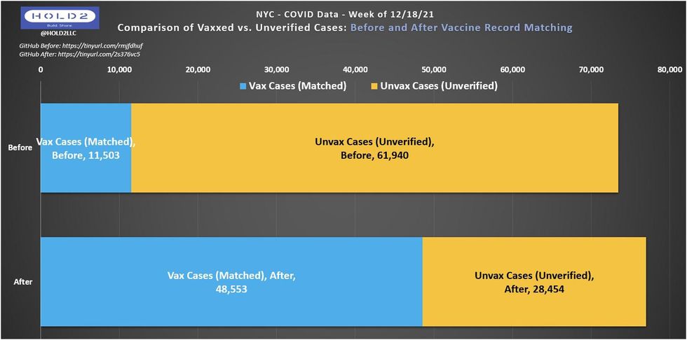
This will also have an impact on the calculation of COVID-19 case rate for the unvaccinated. For example, for the week of December 18, 2021, the NYC Department of Health shows 28,454 cases of COVID-19 among the unvaccinated. Assuming an unvaccinated population of 1,313,253 based on the old population estimate, they arrive at an unvaccinated case rate of 2,166.68 per 100,000 unvaccinated persons.
However, the actual unvaccinated population is at least 470,000 higher, based on the 2020 census. If we add those 470,000 into the unvaccinated population, the unvaccinated case rate drops to 1,595.62 per 100,000 — a decrease of 26.4%.
As you can see above, the differences come just from using a more appropriate population census. But this isn’t the only issue with NYC’s assessment of the data.
Separate from the per 100K population issue is the age adjustment process. NYC Health uses the CDC’s “Age Adjustment Using the 2000 Project U.S. population” document to perform its age adjustment. This document states:
Age adjustment, using the direct method, is the application of observed age-specific rates to a standard age distribution to eliminate differences in crude rates in populations of interest that result from differences in the populations’ age distributions.
This is a standard, appropriate step to take when the comparison cohorts have substantially different age distributions. This is what you would expect when comparing unvaccinated with vaccinated, but which weighting is NYC Health applying to its data? NYC has an unusual age distribution for the unvaccinated cohort, which skews heavily toward 65+ among adults. For example, the figure below demonstrates the age distribution of unvaccinated persons in NYC overlaid with the COVID death rate for the same age groups as of the week of Jan. 8, 2022 (peak deaths for NYC).
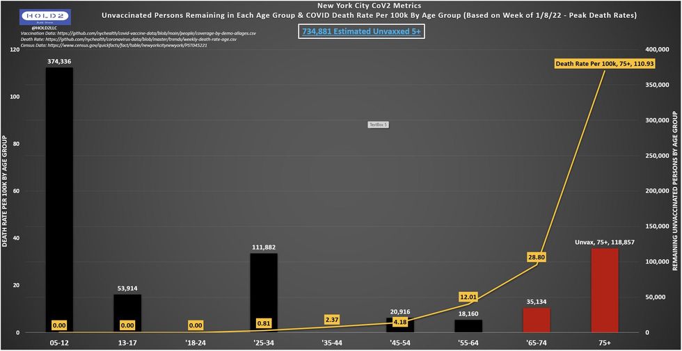
This chart illustrates some startling and counterintuitive data. Among other things, it suggests that there are more persons ages 75 and over who are unvaccinated than there are in age groups 13-24 and 35-74 combined. It also suggests that there are more unvaccinated persons in the 75 and over age group than all other age groups despite having the second-smallest total population. It also suggests that there are more unvaccinated persons among the 65 and over age group than among all persons aged 18-64 combined.
Given that elderly were the first population to receive access to the vaccine and that vaccinating the elderly has been the highest priority of virtually all public health agencies, seeing these startling distributions calls any age adjustment being used by New York City into question. Unfortunately, the NYC Department of Health does not publish COVID outcomes by age vaccination status, so we don’t know how the much higher death rate for individuals over the age of 75 is adjusted for in NYC’s rates.
NYC Health is not transparent with this process and has not shared the formula when requested through GitHub Issue submission.
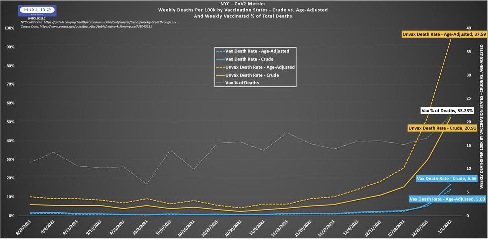
Since we do not yet have the age-adjustment answers, the best we can do is calculate the crude rates (unadjusted) and compare. The graph below shows the difference when we remove the age adjustment AND apply the 2020 census to the unvaccinated rate. Doing so reduces the ratio of the unvaccinated death rate compared with the vaccinated death rate from 6.7:1 to 3.1:1 — a shocking 54% reduction. This figure is likely to increase even further, as it is probable that even more deaths will be changed from unvaccinated to vaccinated in the coming weeks.
The reason for that lies with the next major issue with the NYC data: vaccine record matching (VRM). It may have a more profound effect on the reliability of government data than anyone currently understands.
If you recall from the earlier CDC bullet #1, “unvaccinated” is defined as anyone whose vaccination status has not yet been matched with official records, which means that “unvaccinated” really just means “unverified.” It’s technically impossible to prove someone is unvaccinated, so health agencies simply attempt to verify vaccination for a given COVID case while assuming all others are unvaccinated. However, this verification is difficult, time-consuming, and inconclusive.
So how does NYC Health handle this? The GitHub documentation states, “‘Unvaccinated’ means people age 5 and over with no record of vaccination status.”
No record? Could it be possible that some vaccinated cases, hospitalizations, and deaths are temporarily included in the unvaccinated numerator and excluded from the vaccinated numerator while also remaining in the vaccinated denominator but not part of the unvaccinated denominator? If true, that would be a four-way hit to the unvaccinated-to-vaccinated comparison ratios, artificially inflating VE data for New York City.
Note the dramatic shift in the GitHub the week of Dec. 18, 2021, which went largely unnoticed. What could explain it? The most likely explanation is that vaccine record matching occurs over the course of time and could take as many as eight weeks to achieve high resolution. Some unknown numbers never get matched. Figure 20 below shows how many cases flipped from unvaccinated to vaccinated as part of the VRM process from its first release on Jan. 3, 2022, to the most recent update on Feb. 10, 2022.
Remember the original NYC Health chart showing Hospitalization Rates for the week of Dec. 18? This is how it looks now, after the shift noted above and when applying the 2020 population census, rather than the less accurate 2019 intercensal estimate.
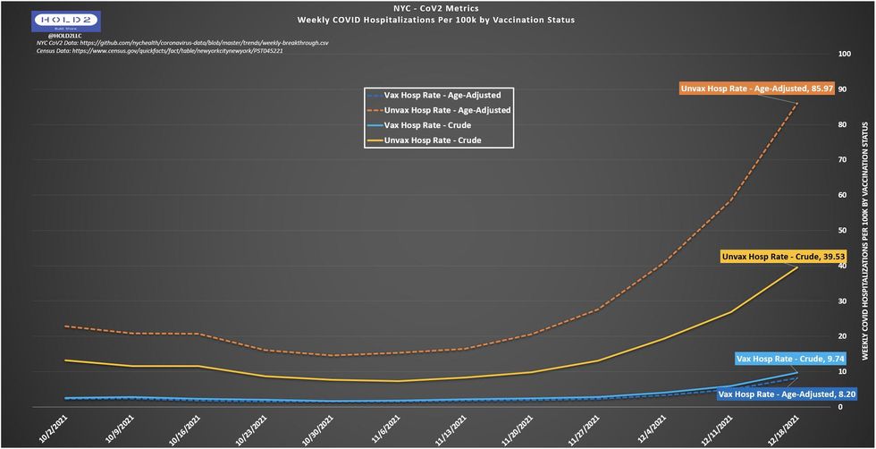
Using this more accurate data, the hospitalization rate ratio for unvaccinated compared to vaccinated drops from 32.5:1 to 10.5:1, if we use the age-adjusted data, and all the way down to 4.1:1 if we use the non-age-adjusted data, an astounding 87% difference.
To be clear, this chart still shows that the vaccine has high effectiveness, but there is a real and meaningful difference in the public perception of being 4.1 times more likely to be hospitalized versus 32.5 times more likely to be hospitalized, if you are unvaccinated. The ratio is almost an order of magnitude lower, and that matters for public policy.
The shift from unvaccinated to vaccinated in NYC Department of Health’s data was not limited to the week of Dec. 18, 2021. Consider the data regarding COVID-19 deaths from the week of Jan. 1, 2022.
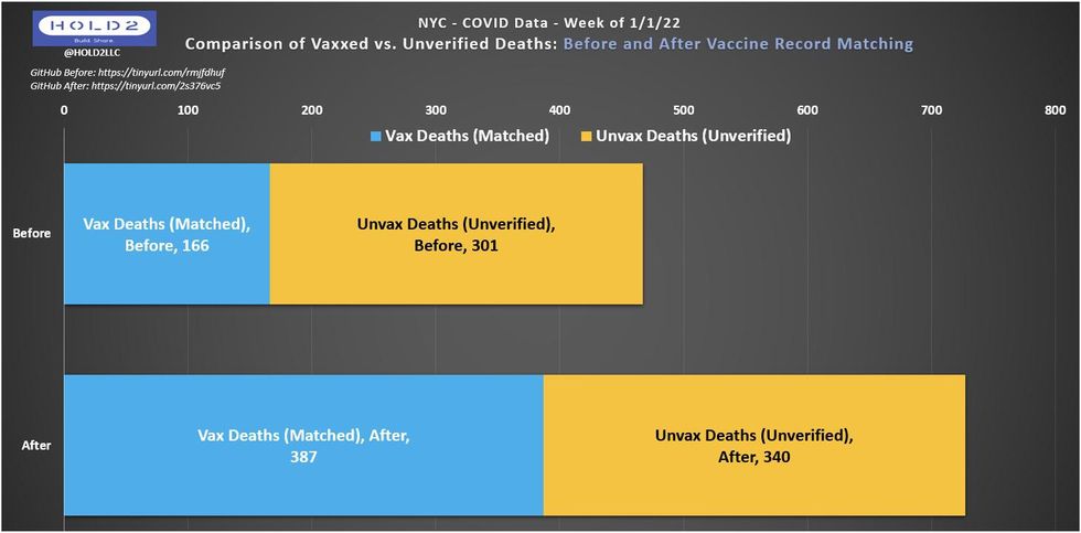
In this chart, the vaccinated deaths increased from 166 to 387 after vaccine record matching, an increase of 133%. Unvaccinated deaths also increased from 301 to 340, an increase of 13%. Clearly, although some unvaccinated deaths were changed to vaccinated deaths, the unvaccinated totals still increased slightly, due to the normal reporting lag for COVID deaths. After the shift, vaccinated deaths increased from 35.6% of the overall total to 53.2% of the overall total. This still shows that the vaccine had efficacy, since their share of the overall population is larger than 53.2% in New York City, but it does not show the same discrepancy as before.
I decided to ask the NYC Health data team about this on GitHub and got an illuminating reply.
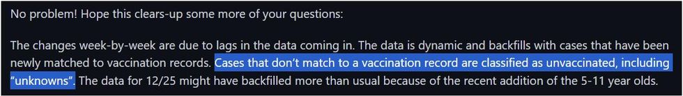
This reply confirms that:
● Yes, the VRM process switches unvaccinated to vaccinated over time (without anyone reporting it or realizing it).
● Yes, this can happen in large numbers.
● Yes, cases that don’t find a matching vaccination record are counted as unvaccinated.
● Yes, even “unknowns” are lumped into the unvaccinated pool.
How big a deal is that? How many possibilities are there for an “unknown” or “unverified” case that actually was a vaccinated person? Let’s look at the Massachusetts Department of Public Health for some clues.
According to MDPH website, in Massachusetts:
● Vaccination identification relies on record matching between systems.
● Vaccinated cases can be undercounted due to simple clerical issues. Reminder: each vaccinated undercount is an unvaccinated overcount.
● Vaccinated hospitalizations are likely undercounted due to case investigation challenges with patient interviews.
One more example is the Oregon Health Authority (OHA) from its Weekly Vaccine Breakthrough Case Report. The OHA admits it was previously lumping unknowns into the unvaccinated cohort. How prevalent was this problem? According to the OHA site, “the vaccination status of approximately one-third of recent cases remains unknown. Oregon Health Authority (OHA) is working toward alternative methods to identify vaccination status for all reported cases in a timely manner. Beginning this week, cases with unknown vaccination status have been removed from... this report.” If Oregon represents a typical jurisdiction, a huge portion of the data being fed into the equation is summarily unreliable.
Credit to Oregon for recognizing the problem and taking measures to fix it; there is no indication that other jurisdictions have any plans to do the same.
The three charts below represent data from the OHA’s reports on Jan. 5, Jan. 20, and Feb. 10, respectively.
Look closely at the data for Week of Jan. 1, which shifts in a manner similar to NYC’s week of Jan. 1:
● Jan. 5 Report: 30.6% of cases were vaccinated persons.
● Jan. 20 Report: 42.7% of cases were vaccinated persons.
● Feb. 10 Report: 52.5% of cases were vaccinated persons.
○ Notice that 1 in 6 cases (17%) still have unknown vaccination status.
○ No cases were added to the total published on Jan. 5, but nearly 2,000 switched from unvaccinated to vaccinated while ~2,600 were switched to unknown.
○ Total shift in vaccinated % of cases: 30.6% -> 52.5% = 21.9 percentage points (+71.6%).
With the Mass DPH calling out its concerns directly, the OHA acknowledging and removing unknowns from the unvaccinated denominator, and NYC Health showing us how volatile the vaccine record matching process is, it’s reasonable to believe this is a widespread problem in the U.S. It’s a problem that would then assuredly roll up to the CDC’s aggregate data set being used to claim massive risk ratios — such as President Biden’s claim that the risk is 97 times greater — for unvaccinated individuals.
Beyond all of these data we see shifting from unvaccinated to vaccinated, there will still be some unknown number of vaccinated cases, hospitalizations, and deaths that never get moved out of the unvaccinated cohort. Because of this and the perpetually low population denominators, U.S. CoV2 vaccination data will always be skewed toward inflating the efficacy of the COVID-19 vaccine to some degree.
So, what should Americans do with this information?
To begin with, they should demand honesty, transparency, and truth. Even with a correct statistical analysis, there appears to be solid vaccine efficacy against severe COVID outcomes somewhere in the single digits. If that’s how much COVID vaccines help, then the public needs to know.
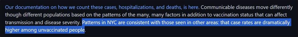
CDC recommendations carry with them extraordinary weight over state and local health departments, which themselves have demonstrated that they believe they have virtually unfettered power over the lives of Americans, particularly when acting in response to a pandemic. With that tremendous power to influence the lives of Americans, the CDC also assumes significant responsibility. It is critical for the public health community to inform both politicians and the public, most of whom have no expertise or background in infectious diseases or public health measures; however, that information MUST be honest and accurate.
I assume the CDC, NYC Department of Health, and other agencies like them are full of well-meaning, highly educated professionals who want to be honest and accurate. That assumption is the basis for my plea to have them evaluate their methodologies, be more transparent with the data, and then report that data in a believable manner that does not skew toward policy narratives.
We should not see comments like this from data team members at major health agencies:
Especially when the assertion is not only false abroad but is even false in the data set this person manages.
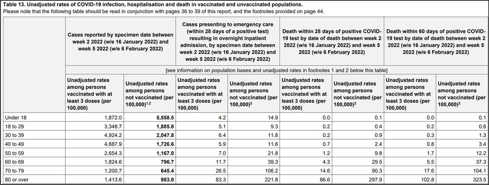
In this UKHSA table, you can see how every unvaccinated adult age group has higher case rates than vaccinated adults of the same age, and this is comparing against people with three doses, not just two.
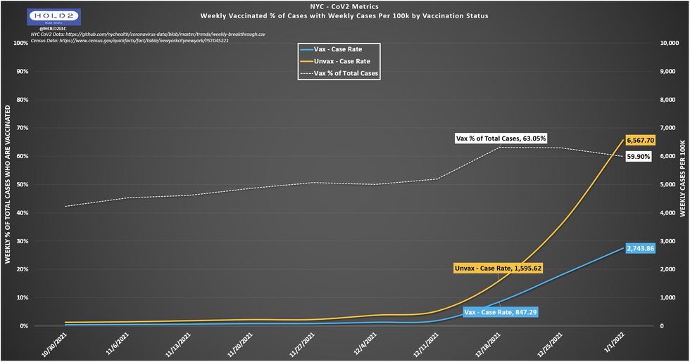
In this NYC chart, I labeled the weeks of Dec. 18 and Jan. 1 on purpose to show how Dec. 18 has completed more of the VRM process and is thus closer together with a higher percentage of vaccinated cases (63.05). Dec. 25 and Jan. 1 are close but have not caught up as much yet. I expect the white line to exceed Dec. 18 as early as the Feb. 17 update. When that happens, the unvaccinated line (yellow) will move closer to the vaccinated line (blue).
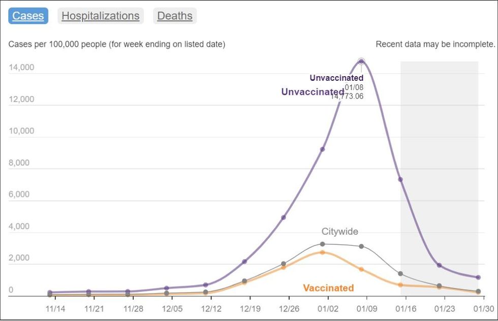
It is unlikely that NYC’s case rates are truly inverse of the U.K., but these are the data we have for now. When you look at NYC Health’s current chart, you see clearly that the week of Jan. 8 is an anomaly due to the extreme difference between unvaccinated and vaccinated, but also because it shows an artificial vaccinated peak on 1/1 (orange line) just like I showed at the beginning with the original week of Dec. 18 chart (Fig. 7). However, this is the chart that got reported widely on social and legacy media without any critical thought or questioning.
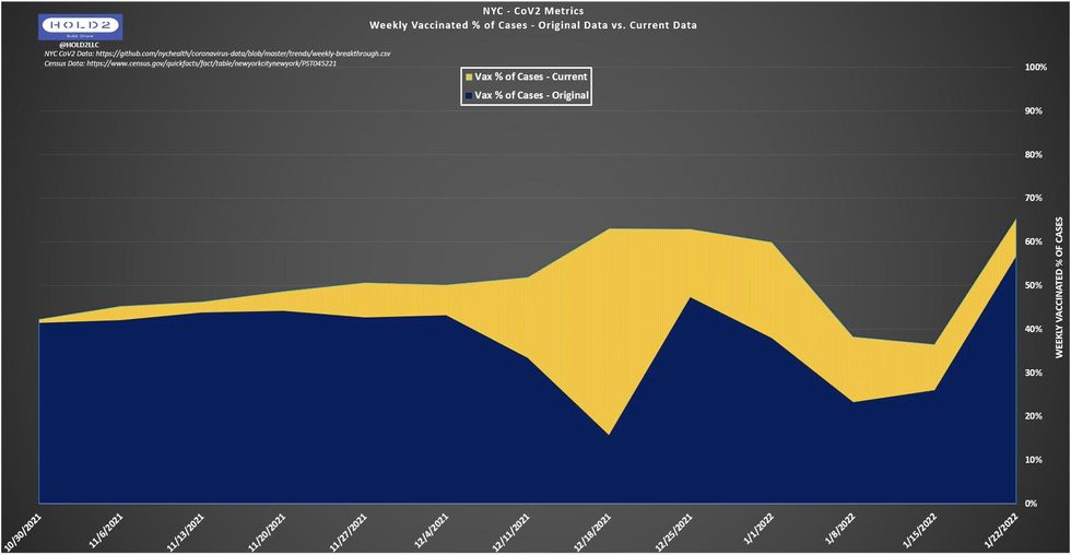
But when you look at my chart below, you can clearly see how the VRM pattern is incomplete for the weeks of Jan. 8 and Jan. 15, where there is currently an artificial dip that corresponds with the inverse mountain on the NYC chart. As you can probably guess by now, the artificial dip in my chart will fill in, and the artificial spike on the NYC chart will lessen, along with a corresponding increase on the orange vaccinated line.
The blue area represents how each week appeared when that week’s data was first released. The yellow area represents how much that week’s data switched from unvaccinated to vaccinated. The more yellow you see, the more cases switched as a percent of that week’s total.
As NYC continues to shift unvaccinated COVID outcomes to the vaccinated side, these data will show less and less apparent vaccine efficacy, but no one will know unless this issue gets addressed not only in NYC but across the U.S.
By stacking the information deck against the public, the public health community and government are gambling with our lives. We deserve and should expect an honest accounting of COVID data devoid of bias and opacity. If truth and transparency are provided, the populace would trust these public institutions, which would lead to healthier outcomes for everyone.